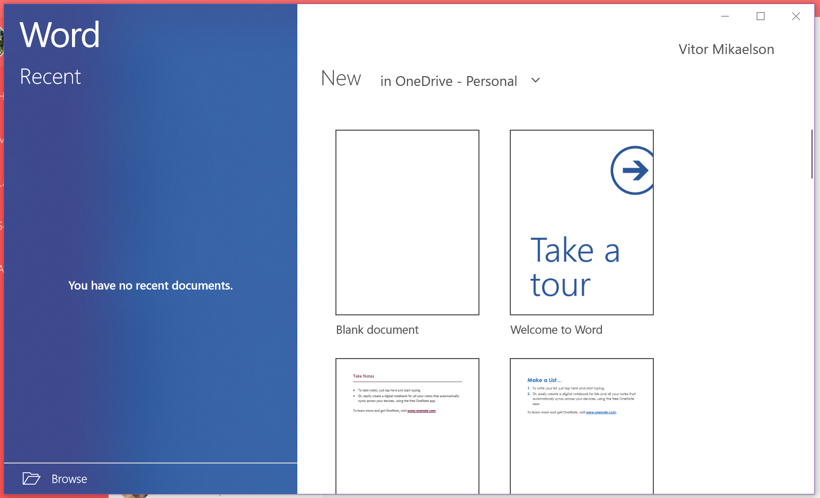
I understand that the looks of Office are not a very important part of the suite, but it is nice to know someone cares about them as well. New icons look modern, and what is more important, they are easy to find – something that is pretty important for mobile device users with small displays. Office’s new robes are an effect of Microsoft using the Fluent Design design, which has also been used in new Windows 10 looks. The new icons can be checked out here.